D is for Dingo Dad
Notes on the design
Digital illustration in Procreate with monoline pen (Relish from RSCO.)
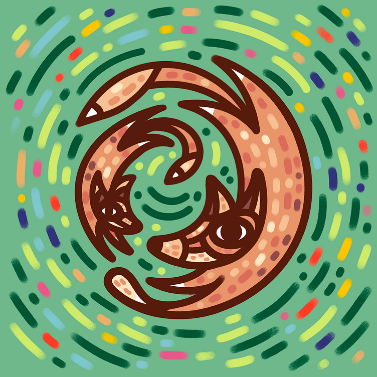
D is for Dingo Dad! The next in the pictorial letterfrom 'Animal Alphabet' series.
This style is the most intuitive for me, in that it doesn't rely heavily on visual reference or exacting details. I start with an image of my subject in mind and then just sit down and draw. I like to play around with shapes and lines to rough-in the composition and action, eventually striking a balance between realism and whimsy.
With a young audience in mind, I'm going for simple line work, with loosely abstract imagery but still representational. I kept the heavy dark outline to pop the "D" letterform shape off of the background.
Once I had my characters (Dingo Dad and kid) and my action (playing together), I could seem them romping and chasing each other like Dads of almost all species inherently understand by nature.
By dropping in a green background I decided to make the scene a field, and had the idea to create motion with circular lines and dots to convey blurred grasses and wild flowers. It almost creates a frozen image effect against the swirling greenery which is kind of cool.
Once I finished this art I realized these could also be seen or pass as foxes! They do surprisingly share several characteristics - blondish-orange coat, pointy ears, curled tail, and white socks. I thought about going back and tweaking the illustration to make them less foxy, more dog-like in head shape, but decided to just roll with it as-is.
The story behind the piece
We're big Bluey fans around our house, and I think this art riffs on the kind of love the show celebrates.
Two of the best parts of being a Dad... being asked to play all-day, every day, and being a big Dingo*
*no offense to Dingos, I've never met one and they probably aren't dorky.
