LinkedIn-UI redesign concept
Hey there,
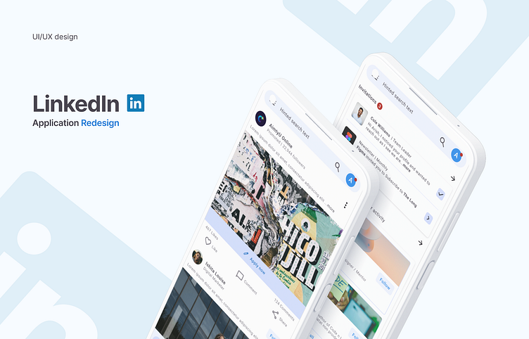
I was wandering in the LinkedIn application just scrolling and browsing and thought why is it so jammed... like there is not much space to breath in. So, What if we redesign the app with a bit cleaner and pleasing way without hurting much of the current UX.. like increasing spacing, clarifying contents with better typography and some basics..
Which leads me to this concept design.. I've redesigned only the base pages like home, network, updates and jobs page only ...
Take a look at those pages at my behance page now...
It would be great to have your thoughts on it...waiting for your feedbacks...
Thank you...
