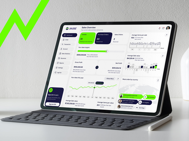
CRM | Sales Analytics Dashboard | Data-Driven | Visualizing
🚀 Sales Analytics Dashboard - UI Design 🚀
Excited to share my latest Sales Analytics Dashboard concept! 🎉 This design aims to provide a sleek and intuitive interface for sales managers to monitor their performance at a glance.
🔍 Key Features:
Real-time Sales Overview: Get insights into transfers, purchase orders, sales orders, and more.
Target & Profit Tracking: Visual representation of sales targets and gross/net profit, with detailed monthly comparisons.
Interactive Charts: Track sales trends, average sale value, and items per sale with clean, minimalistic charts.
Geographic Data: Easily see which regions are performing the best in terms of order volume.
Customizable Options: Sidebar includes payments, reports, settings, and a chance to upgrade to pro for enhanced features.
💡 The goal was to create a dashboard that is both functional and visually appealing, helping users make informed decisions quickly.
🌟 Dashboard Highlights:
Comprehensive Sales Overview: The dashboard provides a quick snapshot of all critical metrics—Transfers, Purchase Orders, and Sales Orders. This high-level view allows users to stay on top of ongoing activities and pending items that require action.
Sales Targets & Performance Tracking: A clear, visual representation of the user’s sales targets, along with comparisons to the previous month. The green progress bar immediately shows how much has been achieved, making it easy to see if the goals are on track or behind.
Gross & Net Profit Breakdown: Users can view their gross profit and net profit in real-time. Positive trends are highlighted to provide motivation, while negative trends encourage actionable insights. A month-by-month comparison keeps users informed on profit growth.
🎨 Design Approach:
The focus was on achieving a balance between aesthetics and usability. The color palette uses a blend of bright green and blue accents for emphasis on key metrics, set against a calming light background to reduce eye strain. Typography and spacing are crafted to ensure easy readability and a user-friendly experience, even when dealing with complex data.
#SalesDashboard
#AnalyticsDashboard
#DataVisualization
#WebDesign
#UserInterface
#ProductDesign
#DataAnalytics
#FintechDesign
#MinimalDesign
Thank You for Visiting!
What do you think? Please let me know in the comment section!
Feel free to leave feedback and don't forget to press (❤️) and don't forget to follow the dribble account to get lots of awesome illustrations.
Interested in Collaborating?
Let's discuss your next project!
Reach Us on Email:
domadiyabhautik123@gmail.com
Connect with Us:


