Our Projects Page for Spray Foam Insulation Tasmania
Client
Spray Foam Insulation Tasmania
Role
UX Designer
Year
2023
⬇️ Full homepage at the end ⬇️
Overview
Spray Foam Tasmania wanted to showcase their diverse portfolio of projects, highlighting their expertise in both residential and commercial insulation work. The objective was to create a visually compelling "Our Projects" page where users could easily browse, view project details, and gain confidence in the company's capabilities.
Problem
The company needed a way to effectively showcase a wide range of insulation projects, including before-and-after images, while making it easy for users to filter and explore specific types of work. Additionally, SEO content had to be integrated without compromising the design.
Approach
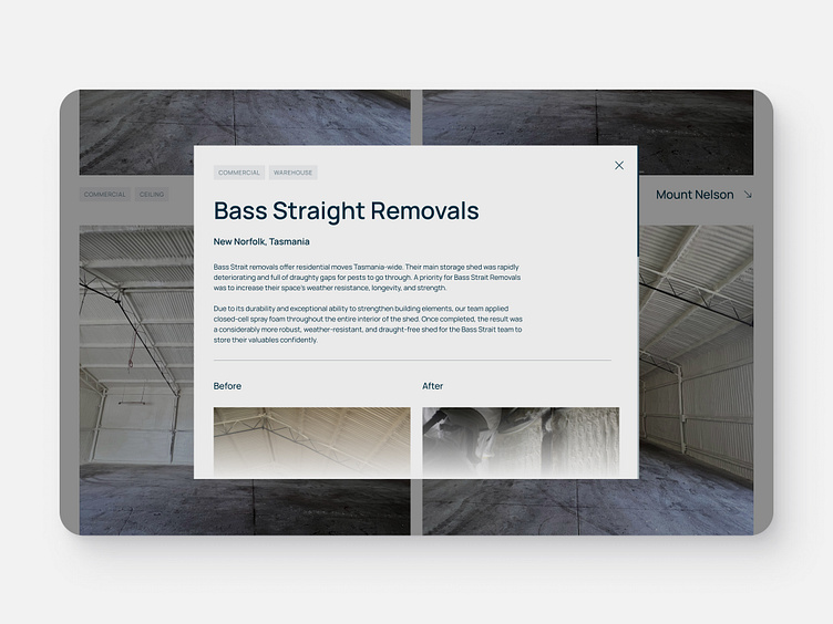
I designed a grid-based layout to neatly display project images, allowing users to view before-and-after comparisons. Each project was tagged for easy browsing, with modals used to display in-depth details. This approach kept the page clean and functional, while also accommodating videos for certain projects.
Solution
✷ Implemented a grid structure to display project images, with a focus on before-and-after transformations.
✷ Used modals to provide users with detailed information about each project without navigating away from the main page.
✷ Added tags to projects, enabling users to identify each post by project type (e.g., residential, commercial).
✷ Included an SEO-friendly text section at the bottom of the page to enhance search engine visibility while keeping the design minimal.
🗂️ Full Page 🗂️
Thanks for stopping by! 👋
If you'd like to connect or reach out, I'd be happy to chat:

