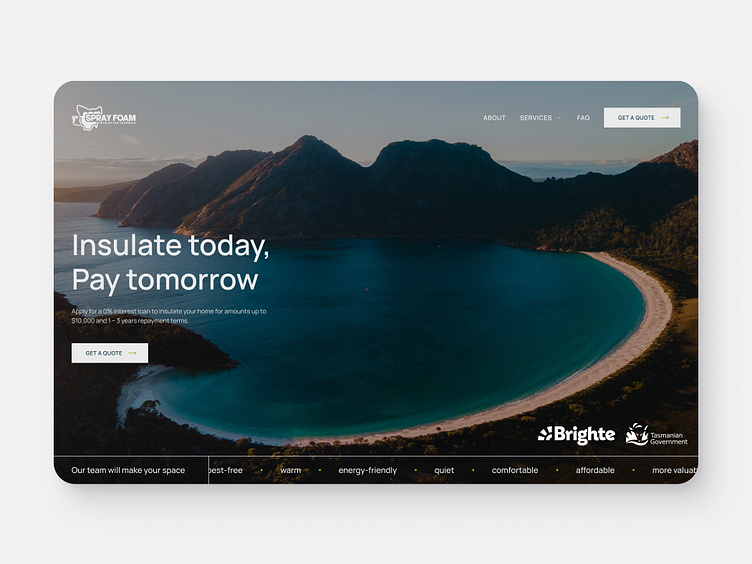
Tasmanian Gov Initiative Page for Spray Foam Insulation Tasmania
Client
Spray Foam Insulation Tasmania
Role
UX Designer
Year
2023
⬇️ Full page at the end ⬇️
Overview
Spray Foam Tasmania needed a landing page to provide important information about an initiative by the Tasmanian Government to help customers access their insulation services more affordably. The objective was to design a seamless user experience that alerted visitors to this new offering, making it easy to navigate to the page from the homepage.
Problem
The challenge was integrating the initiative into the existing site structure without overwhelming or confusing users. Additionally, it was essential to make sure new users were alerted to this new scheme when browsing the site.
Approach
I implemented a homepage popup to draw immediate attention to the initiative and integrated it into the primary navigation. This allowed both new and returning users to easily discover the new scheme without disrupting the overall user experience.
Solution
✷ A clear and non-intrusive popup was added to the homepage, prompting users to learn more about the initiative.
✷ The navigation menu was updated to include a direct link to the landing page, ensuring it was easily accessible from any page on the site.
✷ Existing sections were tweaked for smoother navigation, making it intuitive for both new and returning users to locate and explore the initiative.
🌎 Full Page 🌎
Thanks for stopping by! 👋
If you'd like to connect or reach out, I'd be happy to chat:


