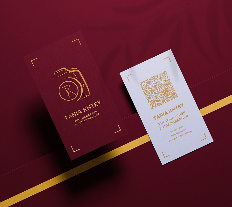
Business Card Design for Photographer
A photographer approached me with a request to design business cards for her photography and videography business. She provided two examples of business cards as references. After analyzing them, I realized she was looking for clean, minimalist cards with either a contrasting or pastel color palette.
Thinking through the design, I decided to propose a logo concept that would immediately signal the services she offers. To achieve this, I incorporated her logos into an illustration of a camera, creating an image that clearly represented her business. I’ve included intermediate versions of the design to showcase the evolution of my concept.
Initially, I created light beige cards (as on the reference), but neither I nor the client felt they made the desired impact. After further discussions, I shifted to a horizontal and vertical design on a dark, rich color background.
Ultimately, the client chose a vertical card featuring a gold foil camera illustration and text. However, the second option—a gold print on a black background—was a strong contender, and I decided to include it in my portfolio to showcase its unique visual impact.
A pleasant outcome was that the design inspired my client to create a new website, and I will also be working on the web design for her.


