Prezex
condom branding
The Prezex condom brand is a new product in its category, but without obvious technological advantages. Therefore, in a competitive category, it was necessary to clearly and at the same time non-standardly convey brand values. The audience was also mixed: both the younger generation, who choose products based on an emotional response, and conservatives, who prefer simple meanings. During the development process, we explored the market and the audience, revealed that the packaging construct is a free niche in the category, and applied it as the main trigger for purchase.
invisible partner
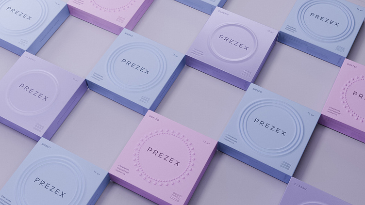
On the one hand, we want condoms to perform their protective function, and on the other — not to dull the pleasure. Or more simply: they worked and did not work at the same time. So we came up with the idea of an invisible partner who accompanies during sex, but does not attract attention to himself. In the design, we conveyed this idea, abandoning graphic elements in favor of tactile sensations from the packaging. We have introduced barely noticeable volumetric elements into the design of the packaging itself, reflecting different types of condoms. Sex is the language of touch, and it is in this language that the Prezex brand speaks to its audience.


