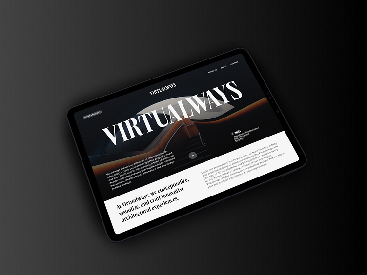
Architecture Studio - Landing Page
This is a blast from the past I found in my drafts - one of my old website designs for Virtualways. I was going for that sleek, modern vibe with a dark background and crisp white text. Threw in that curvy orange line to spice things up a bit. Looking at it now, I'm still pretty proud of how the big "VIRTUALWAYS" header turned out. It's cool to see how my style has evolved since then, but this minimalist approach still holds up pretty well, I think. Funny how some design choices stick with you over time, right?
Follow on Twitter : @designedbyalok
See other project on Instagram: @designedbyalok
Visit: www.designedbyalok.com
More by ALOK ✺ View profile
Like
