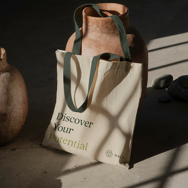
Brand Identity
When you hear "brand transformation," what’s the first thing that comes to mind?
Most of us think it’s just about updating the visuals.
But it’s much deeper than that.
When BACA came to me, they felt their brand wasn’t reaching the right people—their people.
They had another challenge—the clinic didn’t feel welcoming.
To give you context, the clinic helps young adults battling eating disorders.
It needs to be a safe haven, where people feel comfortable opening up.
After our first strategy session, the path became clear.
We created a symbol that represents an infinite connection between each form of support.
At the heart of it is the patient, receiving tailored care.
We also developed an inviting, calming color palette for all brand touchpoints.
It wasn’t just a brand update.
It was about creating a deep emotional connection with patients and those seeking proper care.
See the full project here:
↘︎
See the full project here
↘︎
At Mocci Studio, we're passionate brand makers on a mission to create impactful identities for those who dare to dream.
Follow
Instagram | Behance | LinkedIn
Get in touch

