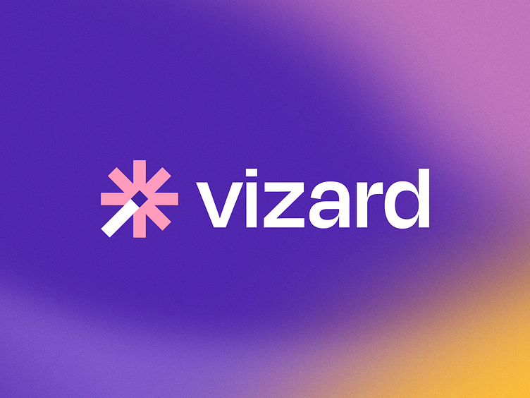
Odi Agency: Vizard Rebrand
Playing into the moniker of Vizard, the logomark showcases the magic behind the brand’s capabilities. We explored a wand being the magical touch that Vizard uses to reformat videos. These explorations focused on the physical wand itself, along with the effects it conjured.
We dubbed the final mark Spark. It utilizes a spoked wheel as the encompassing shape for the wand and accompanying effects. The handle of the wand is intentionally a different color for distinction, as well as slightly extended without breaking the barriers of the container of the shape in its entirety.
The intent was to create a mark that felt tech-forward but that would not fade into the competitive landscape.
The logotype is a slightly customized version of Degular. The clean but fun letterforms paired with the heavy weight leads to a logotype that feels simple and modern, but not alienating.
Are you an early-stage start-up looking for a brand agency?
We would love to hear from you.
Email us: hello@odibrand.agency

