Zello Pattern Design
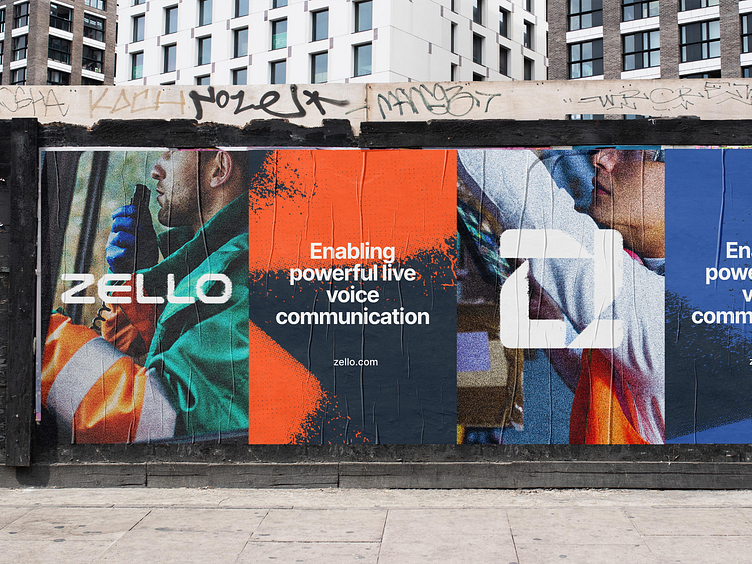
The Zello visual language continues a concept around “Courage in Motion.” Frontline workers are the boots on the ground, tackling daunting real-world challenges every day. They pour their blood, sweat, and tears into their work — all to ensure that things keep moving for the rest of us.
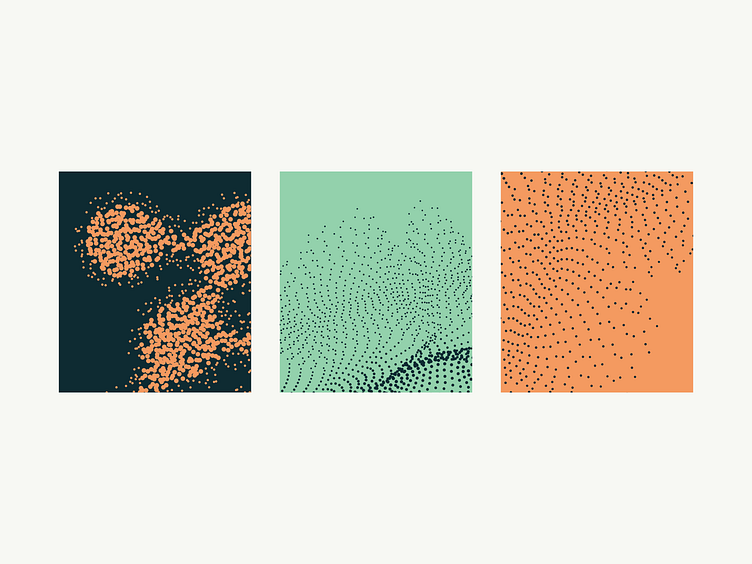
The textured icon treatment is used to communicate that Zello is on the ground with their customers, while the grit texture is based on real environments. It is a dynamic visual element and is encouraged for larger applications.
Colors are strong and the primary typeface — Inter — is a real workhorse, carefully crafted for digital experiences. The photography feels authentic and in-the-moment.
Looking for a brand agency? We would love to hear from you.
Email us: hello@focuslab.agency