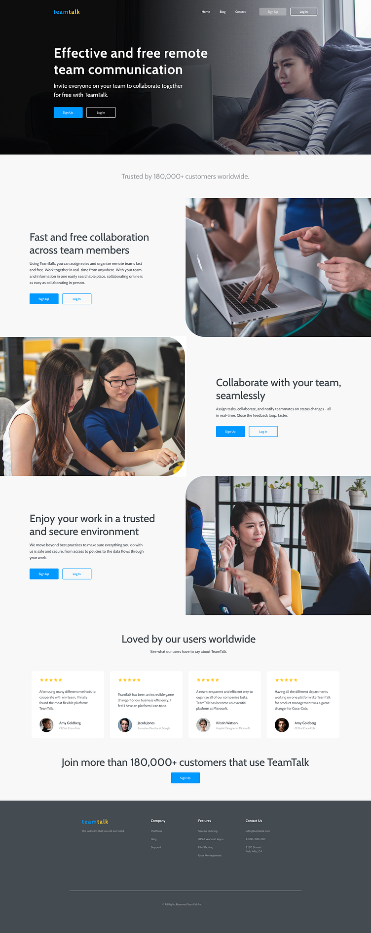
Team Talk Landing Page
Landing Page: The landing page is designed with a focus on clarity and user engagement. It's clean, modern aesthetic emphasizes simplicity, ensuring that key information is easily accessible and visually appealing. The use of minimalistic design elements guides users smoothly through the main features and benefits of the application. The layout is designed to capture attention quickly, with strategic use of white space and intuitive navigation that highlights the app's core functionalities and value propositions.
Blog Page: The blog page maintains the same clean and modern design principles, providing a consistent user experience. The layout is structured to enhance readability and user interaction, with a focus on content organization and visual hierarchy. The minimalistic style ensures that the content remains the focal point, while subtle design elements enhance the overall user experience. The page features well-defined sections for posts, categories, and a search function, promoting easy access to relevant information and fostering engagement with the blog's content.
Both pages are designed to align with the application’s brand identity, offering a cohesive and visually appealing interface that supports user engagement and communication.
Software: Figma, Adobe Photoshop, Adobe Illustrator
Technical skills: Landing page design, Web design, Branding, User Interface design


