Branding and Design for HHWSF
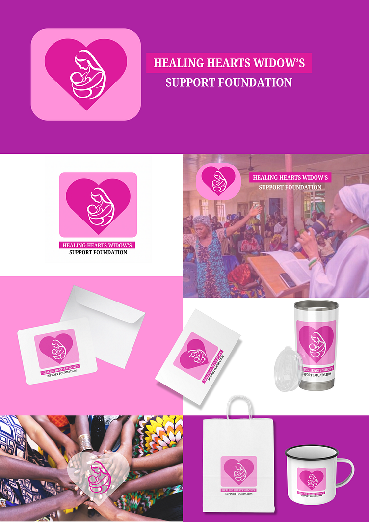
The logo is a symbolic representation of strength, care, and resilience, featuring a woman holding a child. This imagery reflects the core mission of the foundation—supporting widows and their children as they navigate life alone.
Color Palette: Deep pink, light pink, and white were chosen for their emotional resonance. The deep pink symbolizes compassion and empowerment, while the light pink evokes gentleness and care. The white adds a sense of purity and hope.
tyle: The logo uses minimalistic, clean lines to ensure versatility across different mediums while maintaining a sense of warmth and humanity.
The mugs were created to offer supporters and members a keepsake that represents the foundation’s mission. They serve as both functional items and meaningful symbols of solidarity.
Images used for the carousel was from a widows' support event that took place in a community.
Inspirational Fliers
These flyers include motivational quotes and messages tailored to widows, offering hope and encouragement. The designs above and below uses a blend of deep pink and light pink gradients to create a calming yet uplifting visual experience. The typography is modern and elegant, reflecting the positive tone.
Anniversary Service Flier
Celebrating a decade of support and the work of a doctor who has been a key figure in the foundation’s success. The flyer features a formal layout with an image of the doctor. The deep pink serves as the dominant color, providing a sense of importance, while the lighter pink adds softness, symbolizing the caring nature of the work.
General Aesthetic:
Typography: The fonts used are clean and approachable, balancing professionalism with warmth. Sans-serif fonts dominate to keep the overall look modern yet friendly.
Consistency: Across all design elements—logo, mugs, cards, and flyers—the color scheme and imagery are consistent, creating a cohesive visual identity that reinforces the foundation’s mission of support and empowerment.


