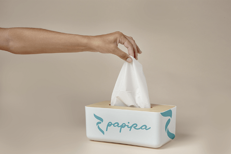
Papira – Softness and Strength in Every Roll
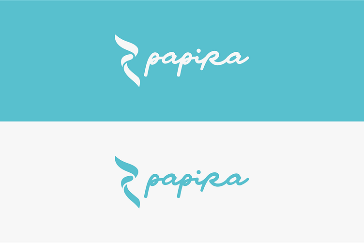
Papira is a brand that produces high-quality tissue products, including toilet paper, paper towels, and facial tissues. The logo reflects the brand’s dedication to offering both softness and durability in every product. The flowing lines in the icon are inspired by the gentle, yet strong texture of tissue paper, while the modern script font conveys a sense of lightness and care.
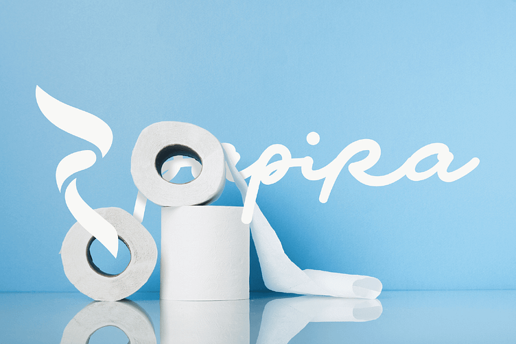
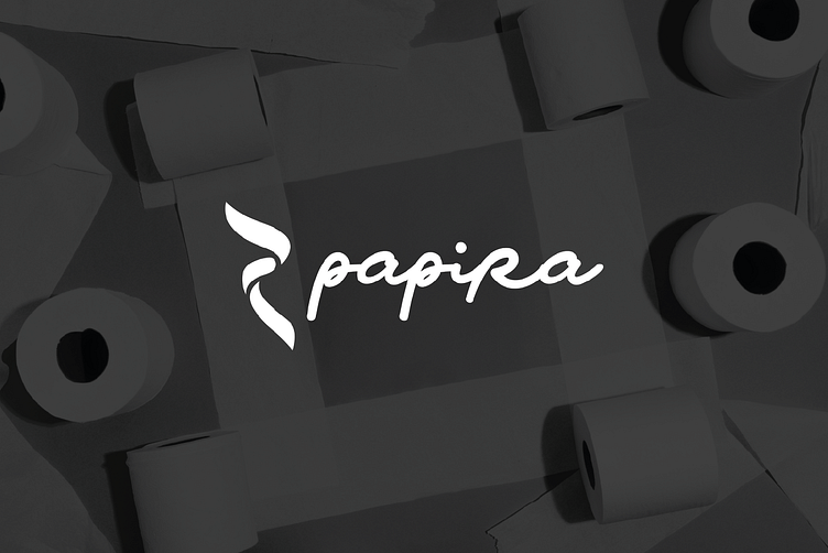
The minimalist approach to the logo design ensures versatility across various packaging formats, from toilet paper rolls to facial tissue boxes. The clean, organic shape symbolizes both sustainability and comfort, aligning with Papira's commitment to providing eco-friendly and reliable hygiene products.
The goal was to create a logo that represents the delicate balance between softness and strength, two core qualities of Papira's products. The curving, smooth lines suggest the gentle nature of the product, while the boldness of the typography adds a sense of reliability and trustworthiness. The monochrome color palette adds an extra layer of sophistication, suitable for a modern, sustainable tissue brand.