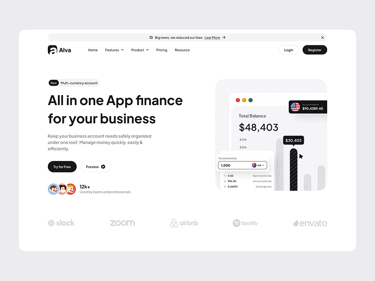
Financial Payment Landing - Hero Section
Hello,
This is the hero section of a financial payment landing page. The clean, rounded, and strong design with black and white colors makes it easy for users to understand. What do you think? Let's discuss! 💬
Interested to collaborate? Let’s connect!
Say hi at xenitystd@gmail.com! Design crafted by Xenity UI.
Xenity studio is a UI/UX design and no-code development agency providing high quality services that help finding solutions with an intuitive approach that meet user’s business goal.
More by Xenity Studio View profile
Like


