Hireology SaaS UX Improvement & Redesign
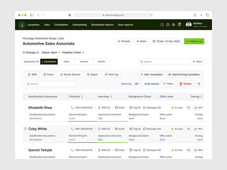
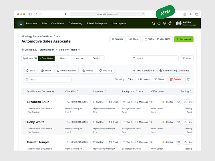
The redesigned interface of Hireology SaaS significantly improves the user experience by enhancing clarity and usability. The before design appeared cluttered, with limited visual hierarchy and less intuitive task management features.
The after design offers a cleaner layout, better section separation, and more prominent action buttons for quick decision-making. This improvement leads to more efficient navigation and task handling, improving overall workflow for users, especially in managing candidate hiring processes. The redesign boosts productivity while maintaining a visually appealing interface.
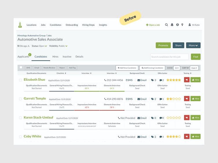
Problems in Before Design:
Cluttered layout, difficult to navigate.
Poor visual hierarchy for task prioritization.
Action buttons not easily noticeable.
Solutions in After Design:
Cleaner, well-organized sections.
Improved visual hierarchy for easier focus.
Highlighted buttons for instant decision-making.


I prioritize continuous learning to deliver design solutions that drive
client sales up by 73% and triple revenue within 90 days.
Curious to know how?
Book a Free call:
Work Inquiries: hello@ashikurr.com
I offer competitive rates for new clients
Hire me Full-time: https://ashikurr.com/
UI/UX Design Tips - Instagram
UI Design Kit - Gumroad
Follow me: Linkedin | Twitter | Instagram | Facebook | Behance