Dashboard Design for Health Platform
Hi everyone,
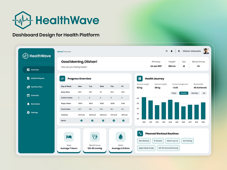
I am thrilled to introduce HealthWave! The primary goal of this interface is to offer users a concise, motivating, and transparent overview of their health. Below are the key design choices:
User-Centered Design:
Clean and Simple Layout: We've kept the interface tidy and easy to navigate, so you won't feel overwhelmed by too much information.
Focused on What Matters: We’ve highlighted key health metrics like steps taken, sleep, calories, and hydration, making it easy for you to track your progress without any hassle.
Information Architecture:
Overview Segment: A welcoming greeting, the user's name, and a well-being prompt create a personalized atmosphere to start the user experience.
User Profile: Displaying key details like birthday, height, weight, and blood group adds a personalized touch to the dashboard.
Data Segments: Health data is categorized into sections like Medical Reports, Nutrition Plans, and Schedules to facilitate smooth navigation.
Visual Representation of Data: The dashboard features charts and graphs to help users easily comprehend trends in weight, caloric intake, and other vital stats over time.
This health and wellness dashboard provides an easy-to-use platform for tracking your progress and maintaining overall well-being. It focuses on clear, easy-to-understand information, actionable insights, and personalized touches.
I’m excited to hear your thoughts! Let’s chat about any features or tweaks you think could make it even better.
https://app.uxcel.com/showcase/healthwave-dashboard-design-for-health-platform-898
