Web site for organic food store
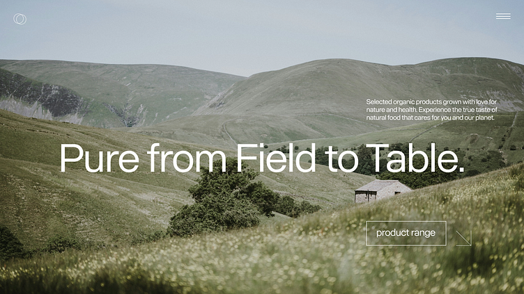
The large, bold sans-serif font used for "Pure from Field to Table" creates a strong contrast against the soft background. It's modern, clean, and highly readable, making it the focal point of the design. The choice of font and its weight effectively conveys a sense of trust and simplicity.
My portfolio on Behance:
https://www.behance.net/e219ff9eEnter your text here...
Let's cooperate
Outlook - darina.web-design@outlook.com
