Zen2Fit Visual Identity
Client: ZEN2FIT LLC
Services: Visual Identity, Brand Support
Year: 2023
Design and Concpt: Sanjin Halilovic
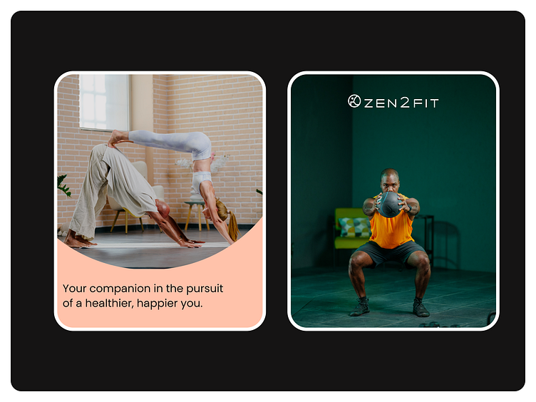
Zen2Fit is an online platform and mobile app focused on enhancing well-being with fitness programs, mindfulness practices, and expert advice. Achieve a balanced lifestyle with our exercise routines, meditation sessions, and healthy habit tips.
Zen2Fit designs programs and tools for healthy lifestyle habits, with the aim of enabling users to acquire healthy habits through an easy-to-use application, with a variety of fun activity options: workout, fitness, yoga, kickboxing, hypnosis and meditation for a healthier and better life. The purpose of programs and tools is to stimulate metabolism, promote and enable healthy habits and optimal weight, enable complete transformation of the body while neutralizing the aging process, and offer an optimal nutrition program with opportunities for interaction and progress monitoring. It has a holistic approach, i.e. it does not only and exclusively deal with exercise as a goal for achieving optimal body weight, but also the importance of sleep, regular meditation, healthy eating habits, possibly occasional fasting to achieve a healthy balance of body and mind, and other healthy lifestyle habits.
How Did We Create Zen2Fit?
After receiving the brief for the Zen2Fit visual identity project, the first step was to conduct research, analyze competitors, and study the visual communication methods to position the brand as uniquely as possible in the market.
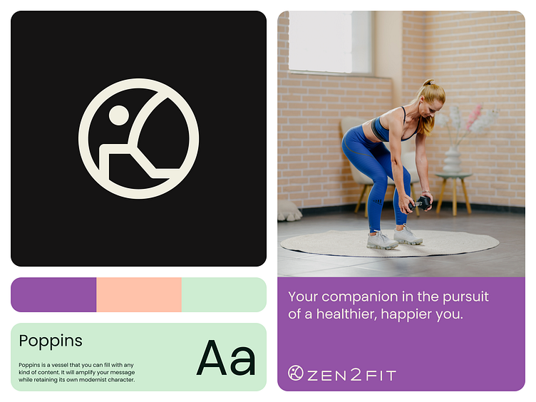
We had two directions derived from the root of the word – Zen and Fit. After the first phase, we decided on a more moderate communication approach, using pastel colors, fluid forms, and everything that stems from the concept of meditation.
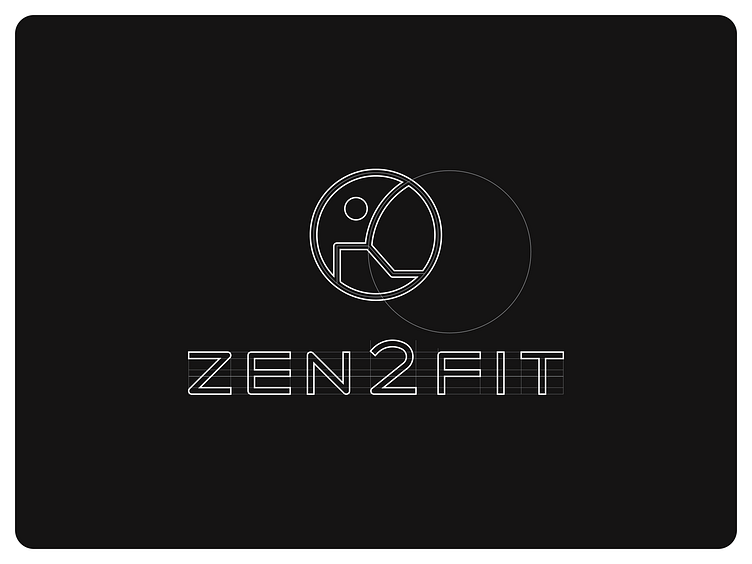
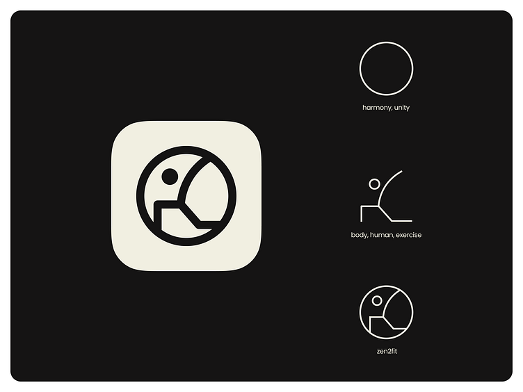
This fluid form was used in the creation of the symbol, which emerged after numerous sketches and conceptual designs. The line of the Warrior I pose was used, which with its movement ideally corresponds to some of the key words that came from the mind map, such as human, body, and exercise. These words were incorporated into a circle (harmony and unity), thus rounding out this unique symbol.
The typography was carefully crafted through a grid system, with simple lines to achieve a modern form characteristic of the technological world, as this is an app and a digital product. Through the symbol described above and such typography, the Zen2Fit company logo was unified.
As I mentioned at the beginning, warmer pastel colors with their shades will be used in communication to satisfy ergonomics and readability.