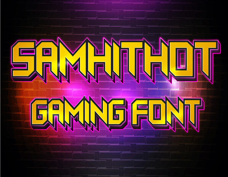
Samhithot Font
Gallery OF Samhithot Font
Making of Samhithot Font: A Designer's Perspective
Creating the Samhithot Font was an exciting journey for me as a designer. With Samhithot, I wanted to explore a fusion of modern, dynamic shapes and playful, expressive characters. The challenge was to create a typeface that would be striking, yet highly legible, making it perfect for a variety of design applications.
Concept and Inspiration
The inspiration behind Samhithot Font came from modern design trends that focus on sharp, energetic forms combined with fluidity. My aim was to design a font that would stand out, capturing attention while remaining functional in both digital and print formats. I also wanted the font to carry a unique flair, suitable for creative projects that require something different and bold.
Design Process
Conceptualization and Sketching: The process began with brainstorming and sketching ideas for the overall look and feel of the font. I envisioned a design that would balance energy and precision, resulting in characters that were both sharp and visually captivating.
Digital Design in Adobe Illustrator: Once the initial sketches were finalized, I transitioned to Adobe Illustrator to start the digitization process. Illustrator’s vector tools allowed me to craft each character with precision, ensuring that the lines were sharp and the curves smooth.
Balancing Dynamism and Readability: A key challenge in designing Samhithot Font was achieving a balance between dynamism and readability. I wanted the characters to convey movement and excitement while maintaining clarity across various sizes. This involved fine-tuning the proportions and making sure that each letter was distinct yet harmonized with the overall font structure.
Vector Refinement: After defining the character forms, I worked on refining the vector paths to create clean and polished letterforms. This process involved adjusting anchor points and curves to make sure the shapes were as smooth and accurate as possible.
Kerning and Spacing: Kerning and spacing were essential to ensuring the font’s usability in different design scenarios. I spent time adjusting the spacing between characters to make sure Samhithot Font would look balanced and cohesive, whether used for headlines, logos, or creative text layouts.
Testing and Final Touches: The final step involved testing the font in various contexts and sizes. This iterative process allowed me to make final adjustments and ensure that the font was both visually striking and functional.
Usage and Availability
Samhithot Font is available for free personal use. For commercial use, it can be acquired through Creative Fabrica. You can find it here or contact me directly at fontdesigner467@gmail.com for commercial inquiries.
Designing Samhithot Font was a creative and fulfilling process, and I’m excited to see how it can be used to add a dynamic, bold touch to various projects. Whether it’s used for branding, posters, or digital content, I hope this font helps designers achieve the impact they’re aiming for.


