Logo & Brand Identity for Klaggerod
⚫ Case Study for Kläggeröd ⚙️
⚙️ Kläggeröd provides top-tier industrial solutions, known for their high-performance and professional-grade products and services. Their mission is to deliver reliable and action-oriented solutions, backed by innovation and expertise in the field.
➡️ Challenges: The main challenge was to craft a visual identity that reflected Kläggeröd’s industrial prowess while ensuring the brand remained modern and approachable. The design had to project professionalism and strength, without being overly complex or generic.
➡️ Solutions Implemented: We employed a bold, clean aesthetic using strong, industrial colors to emphasize reliability and action. The minimalist approach, with a focus on precision and clarity, resulted in a logo that represents the brand’s core values of professionalism and high standards.
➡️ Results: The new logo and visual identity enhanced Kläggeröd’s brand recognition within its industry. The strong design resonates with professionals seeking high-quality, reliable industrial solutions, further solidifying Kläggeröd’s reputation for excellence.
➡️ Conclusion: Kläggeröd’s new brand identity not only stands out but also reinforces the brand’s commitment to reliability, precision, and professionalism in the industrial sector. The thoughtful combination of color, typography, and clean design ensures the brand is both modern and trustworthy.
💡Ready to elevate your brand identity?
⭐ Let’s create a professional visual identity that reflects your values!
#brandidentity #visualidentity #casestudy #industrial #branding


⚫ Logo & Brand Identity for Kläggeröd ⚙️
⚙️ Kläggeröd is an industrial brand that specializes in delivering high-performance solutions for professional environments. Their clients consist of businesses and professionals who require robust, reliable, and action-driven services.
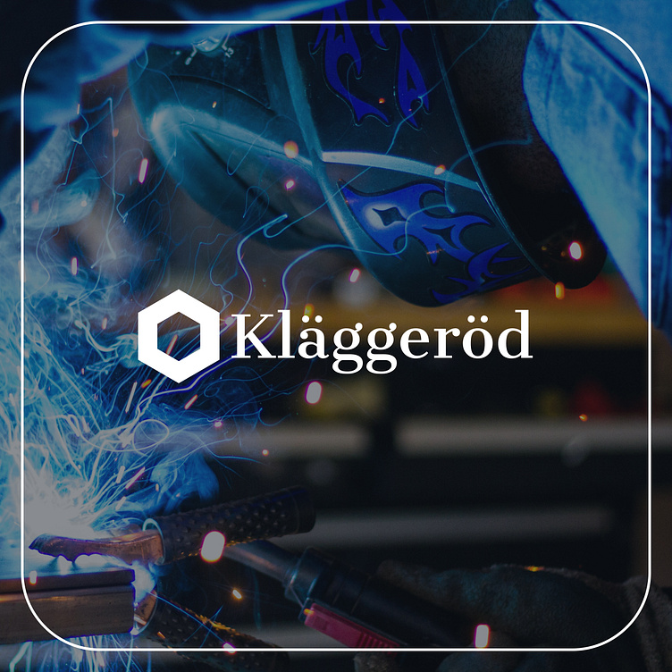
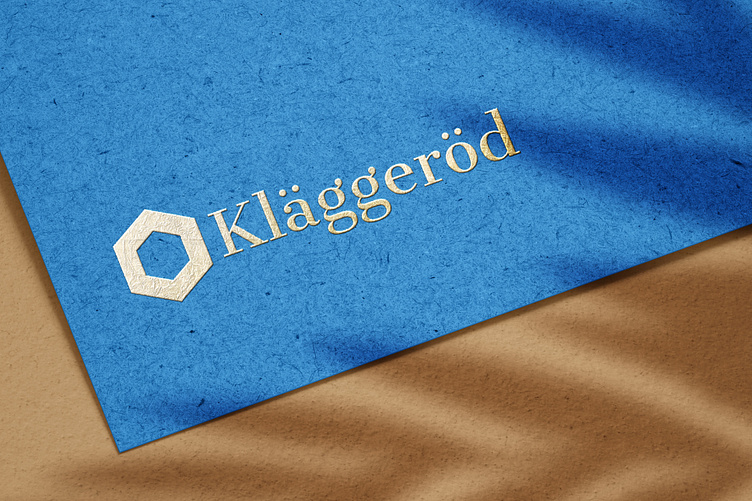
✅ The logo design emphasizes a strong and bold visual identity, utilizing an industrial aesthetic to reflect the brand’s professionalism and precision. The use of clean, sharp lines paired with an intense color palette captures the essence of the brand’s identity, reinforcing its commitment to high standards.
➡️ Challenge: Develop a brand identity that conveys the strength, action, and professionalism of Kläggeröd while maintaining a sense of modernity. The design needed to appeal to a professional audience without losing its industrial roots.
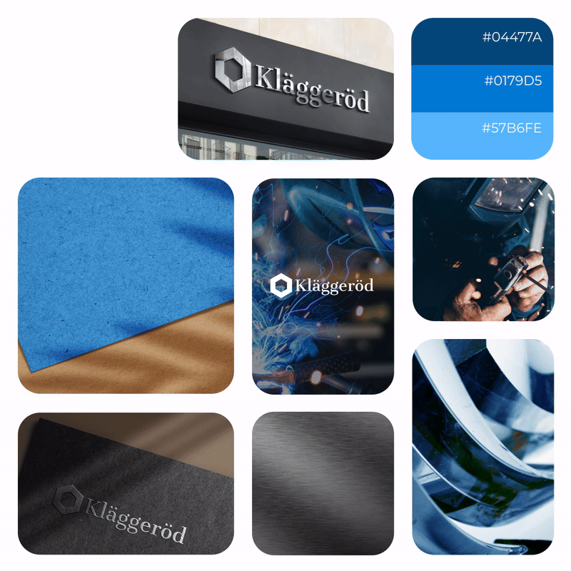
🔵 Darker Version (Indigo Dye #04477A): A deep, strong blue that communicates reliability and authority in the industrial sector.
🔵 Primary Colour (Bright Navy Blue #0179D5): A vibrant tone representing trust, innovation, and dependability.
🔵 Lighter Version (Blue Jeans #57B6FE): A lighter blue used for versatility, adding brightness without compromising the brand’s core identity.
➡️ The new brand identity has successfully positioned Kläggeröd as a modern, reliable, and professional brand within its sector. The combination of strong visuals, bold typography, and industrial tones ensures that the brand stands out, while still aligning with its values of precision and excellence.
⭐ The choice of Cantana One Regular for headlines adds a bold, industrial edge, while Helvetica Neue Thin for body text ensures clarity and a sleek, modern feel.
#logo #logodesign #branding #brandidentity #industrialdesign