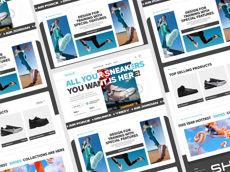
Minimalist Modern Shoe E-commerce UI Design
In this case study, I am excited to showcase a clean, intuitive, and user-focused UI design for a shoe e-commerce platform. The goal was to create a visually appealing and seamless shopping experience that caters to modern online shoppers. The project centers around delivering a design that balances aesthetic appeal with functionality, ensuring a smooth user journey from browsing to checkout.
The design starts with a minimalist approach to the homepage, where simplicity takes center stage. The layout is clean, with ample white space, allowing the products to stand out without overwhelming the user. I focused on large, high-quality product images, as visuals play a key role in attracting attention in e-commerce. A hero banner showcasing the latest shoe collections welcomes users, combined with a clear call to action that encourages browsing or shopping the latest arrivals.
Product pages are designed to offer a detailed yet distraction-free experience. Each shoe has been given its own space, with large images that can be zoomed in on, ensuring customers get a detailed view of every angle. I paid special attention to the information hierarchy, making sure that the product name, price, and size selection are easy to find. The "Add to Cart" button is strategically placed to catch the user's eye without being intrusive. To make it even more user-friendly, I integrated a simple color palette, focusing on neutral tones that align with the clean, modern aesthetic of the brand.
Let's chat 👋
or
nirobman100@gmail.com / facebook / WhatsApp: 01758235283
We are open for partnership to build your next awesome product


