guidey
When guidey approached us to create their brand, we knew we had a fun and challenging project ahead. They wanted a brand that was both trustworthy and modern, but also had a ton of personality.
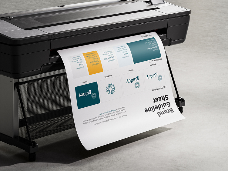
We started by diving deep into the world of travel, exploring different destinations and learning about the kind of experiences guidey wanted to offer. This helped us to understand their unique voice and vision. From there, we developed a brand identity that was both visually appealing and informative. We chose a simple yet powerful symbol: flight paths within a circle, representing the journey of discovery. The color palette was inspired by nature, warm and inviting. To ensure a consistent brand experience, we created a set of brand guidelines that were easy to follow. We also used Adobe Express to create templates on the go while maintaining a cohesive look and feel. Adobe Express we LOVE YOU! One of the most challenging parts of the project was finding the right balance between formality and fun. We wanted the brand to be professional, but we also wanted it to have a friendly and approachable personality. After experimenting with different styles, we settled on Source Sans and Oswald, a font combination that is both legible and engaging.
