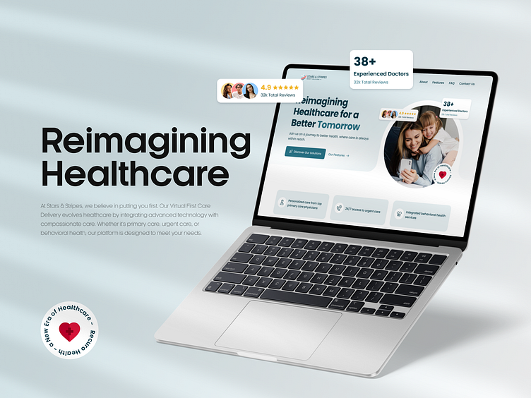
Medical startup | Webflow | UI/UX Design | Product Design
Intro
Here is a website designed specifically for an American healthcare SaaS startup that aims to simplify the process of consulting a doctor and getting timely help.
Request
Healthcare in the United States is very expensive and bureaucratic. People can wait months to get an appointment with a doctor. Because of this, many people may not receive timely care. That's why our client wanted to change this and came up with a great idea to allow customers to get a consultation with a professional doctor online on the same day.
The main design request was to show customer focus and humanity because medicine is primarily about people.
Work process
During the initial communication, the client showed how passionate he was about this idea and wanted to make a difference. Realizing this, we wanted to do everything possible on our part to bring this idea to life.
First, we analyzed the market and other similar projects to understand the general concept of such startups and to identify the points that would become our specialties. That's why we decided to focus on people and families because even before we started, we discussed that this service would be “for people” and “about people.”
The next step was to develop the design. We used brand colors and blocks with a combination of people and the general theme of the site.
After implementing the design, we developed the website, adding functionality and animation.
Conclusion
This website is an example of how the idea of simplicity and easy interaction can be realized in design. This site will be one of the key factors that will help a bold idea become a reality.
Heading
Enter your text here...


