Single Color UI Explorations
The Background -
I've always been intrigued by monochromatic UIs and have had the opportunity to explore this style consistently in my projects over the last six years. For me, the ideal UI is almost entirely black and white (I prefer a dark theme) with minimal, if any, use of color.
I’m drawn to this style not only because it appeals to me aesthetically but also because I believe it creates a better user experience. The absence of contrasting colors and elements forces more thoughtful consideration of layout and design choices. This often results in more use of blank space and a deliberate approach to element placement, leading to a clean, focused UI that allows users to complete their tasks easily and efficiently.
The Exploration -
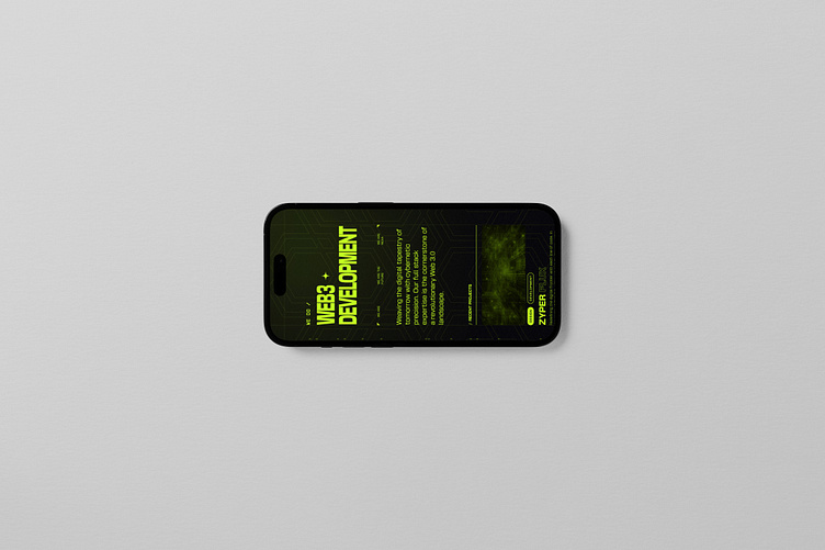
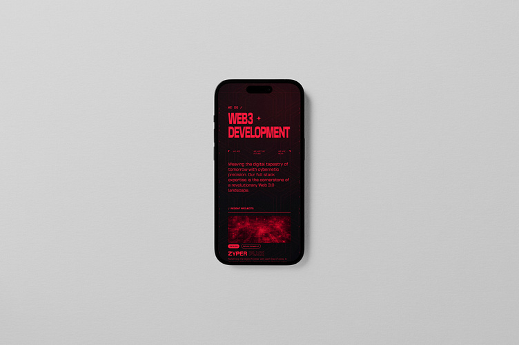
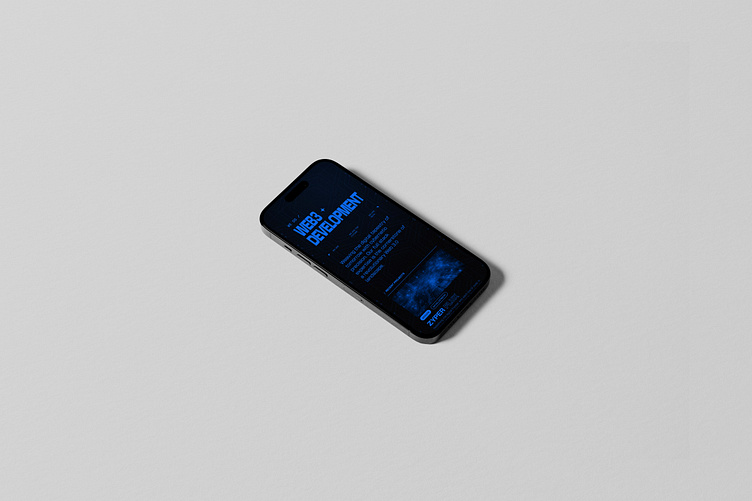
Recently, I've been intrigued by the idea of expanding on the standard monochromatic style by incorporating color—imagine an entire UI designed in shades of red or blue (Text Included...I know, scary).
To start visualizing this concept, I created a simple webpage design. I believe this approach could work well for websites, though it might be more challenging to apply to web or mobile apps. Yes, there will be lots of accessibility concerns most likely to work through but that's the exciting part, and it's something I plan to explore further.
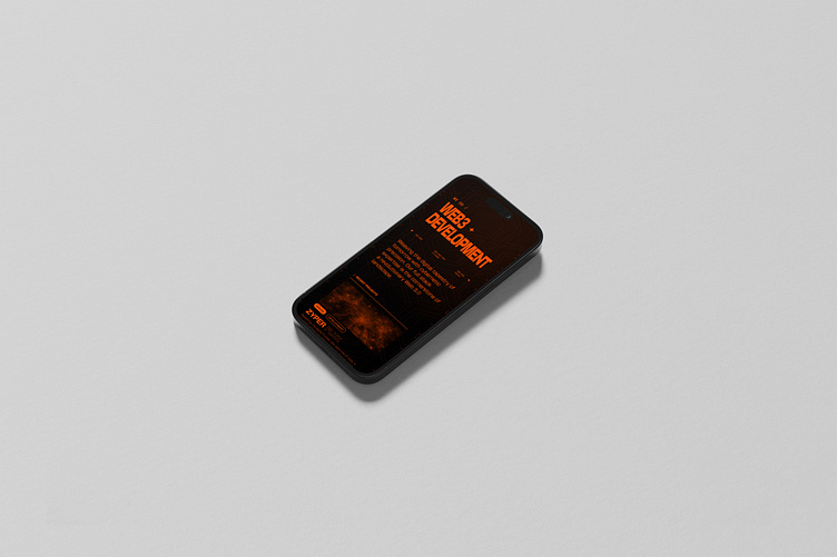
Which Would You Choose?
I plan to continue to explore this side project and ideally find the perfect use for it. Let me know what you think about the style idea and if there is any other color comparisons you would like to see.