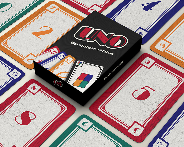
UNO: The Vintage Version
The idea behind "UNO: The Vintage Version" came from wanting to give the classic game a fresh look while still making it feel familiar. I was drawn to vintage styles, so I decided to mix the elegance of Art Deco with the fun, playful vibe of UNO. My goal was to create something that both design lovers and casual players could appreciate—a version that feels timeless but still keeps the same gameplay we all know.
Inspiration
I was really inspired by the bold, geometric shapes of the Art Deco movement, which has this perfect mix of modern and decorative elements. Think sharp lines, stylish patterns, and retro colors—kind of fancy but still fun. I wanted the cards to reflect that classy look while keeping them approachable and easy to enjoy.
Design Choices
Layout
The card layout is cleaner, with simpler lines and a focus on clarity. The idea was to make the cards look sleek without over-complicating things.
Typography
I picked fonts that give off a retro vibe, adding a touch of elegance while staying true to UNO's playful spirit.
Color
I went with the traditional UNO colors but I tweaked each one to fit with the old-fashioned style. This way, it's easier to tell the cards during the game.
Design Challenges
One of the biggest challenges was balancing the aesthetics with the functionality of the game. I had to make sure the cards still felt like UNO, even with the new design elements. I tested different color schemes and layouts to ensure the game stayed intuitive, whether you’re a new player or a seasoned pro.


