Daily UI #003 - Landing Page
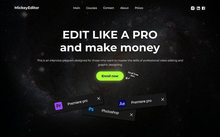
For Day 3 of my 100-day UI design challenge, I created a landing page UI for a video editing and graphic design program called MickeyEditor. This design aimed to build an engaging and visually striking layout that communicates the program's value proposition.
Key Elements of the Design:
Bold Headline and Clear CTA: The main headline is designed to capture attention, while the bright CTA button encourages users to take action.
Dark-Themed Background: A space-themed background creates a professional and dramatic look, aligning with the theme of mastering professional editing skills.
Simple Navigation and Social Links: A straightforward navigation bar and social media links ensure users can easily explore and connect.
I would love to hear your thoughts, feedback, or suggestions on improving this design! Your input is invaluable as I continue to learn and grow through this challenge. Thank you!
