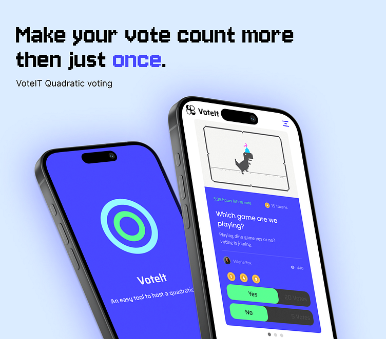
VoteIt - Quadratic voting tool
The assignment required groups of four to create a quadratic voting tool, aiming to produce essential components and a functional prototype. The primary deliverables encompassed a style library covering color palettes and typography choices, a component library for consistent design elements, and a clickable prototype for user interaction. Additionally, a bonus was offered for teams that successfully designed the tool for both desktop and mobile interfaces. The focus was on collaborative development, ensuring a comprehensive tool while meeting the bonus objective for versatile interface design.
Quadratic voting
Quadratic voting is a collective decision-making procedure which involves individuals allocating votes to express the degree of their preferences, rather than just the direction of their preferences.In this context quadratic voting is used withing your social group to get opinions of people regarding plans, activities and personal positions.
Moodboarding
Taking our target group into account: our classmates, we opted for a spontaneous organic design. This because looking at our inspiration sources and design trends from this generation this is something we see coming back a lot. This is because our target group is mainly Gen Z who actively plan within groups such as: Housemates, groups of friends, families. We started by recording our vision on a mood board. The main goal of the inspiration was a user-friendly interface with as few clicks as possible. All main information can be found on 1 page and not hidden under menus. This was chosen because the concept of the app is quite simple and small, we wanted to reflect this in the interface. When not providing the user with important information but guiding them through their goals fewer clicks make for a better UX, stated by Weber (2021).The created mood board contains sources with colorful appearances that relate to the target group, and a simple appearance in the buttons and input boxes. We have incorporated these components into our design from the sources
Design System - Atomic Design Methodology
Atomic Design is a visual identity system methodology that separates the entire process when developing visual systems in a more organized way using atoms, molecules, organisms, templates, and pages. For example, a search icon and an input box are two separate atoms.I choose this to introduce my team, who is not familair with figma, on of the (in my opinion) easiest way to set up your design system figma file as friendly as possible to deliver to a developer. I myself have experience with both designing and guiding the file into development and atomic design helped me a lot with substantiating my components.
Tokens - Typography
Working in atomic design we started by recording the font. This arose from the minimlastic radiation of our sources of inspiration. The H1 to H3 font was chosen: Segoe UI. This font is often seen in frequently used Microsoft software. This suits our target group and their purpose within our application. Clear, quick to use and all information in one place. It was also decided to use the Saira font sporadically. Saira is a contemporary sans serif system and is often used in places like newspapers and books making it highly compatible with our app. To ensure the sustainability of the application, I want to use as little variable as possible. By creating and calling more variables your essentially given the server more data to send and receive. The server has to process more data and uses up more energy then actually needed.
Tokens - Colors
The following primary colors were created from the sources of inspiration in the mood board: Dodger Blue and Screamin' Green. This was chosen because we wanted the application to match our diverse, young target group. These colors are clearly reflected in the inspiration sources and can be found in apps such as Spotify, festival websites and museums. These have something in common: wanting to be heard. At VoteIt, users will be heard and voted on in our app. The colors are supported by an eye-pleasing dark secundaire background to make the colors stand out more. For the primary color, a complimentary blue was chosen, which is reflected in secondary buttons. In addition, the unreachable functions or informational components will be shown in a lighter gray background.
Final Concept - Hi-fi prototype
Meet VoteIt, the quadratic voting tool! Easily create a group with your friends or family and ask them for an opinion. Each voter receives a number of points that he can spend per statement, depending on how strongly someone feels about the statement. Keep voting until you run out of points! The young and vibrant visual choice is clearly reflected in the end product. Despite the use of a white background, the app radiates a dark appearance. Looking back at our process, the benefits of a design system clearly emerged during prototyping. If I were to restart the project I would have clarified the primary features such as voting and provided more prominent feedback to the user. I will also explain the consequences of quadratic voting in a zero state because this is not clear at first glance in the current design.
We opted for an app to easly save the users data without having a unnessaccry login screen when working in a browser. When designing we kept in mind the components should relate to an app: No login screen, no side menu’s and phone view designing. Plus app offer better analytics, i.e., more accurate data collection and conversion tracking. Thi is especially handy when working with bigger voting groups within the app. And offering to see you last updated data offline


