Tattoo Studio's Landing Page Redesign
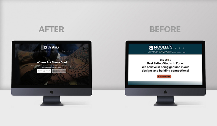
𝗗𝗮𝘆 𝟭𝟰 𝗼𝗳 𝗠𝘆 𝟯𝟬-𝗗𝗮𝘆 𝗨𝗜 𝗗𝗲𝘀𝗶𝗴𝗻 𝗖𝗵𝗮𝗹𝗹𝗲𝗻𝗴𝗲: 𝗔 𝗖𝗼𝗺𝗽𝗹𝗲𝘁𝗲 𝗥𝗲𝗱𝗲𝘀𝗶𝗴𝗻 𝗼𝗳 𝗮 𝗧𝗮𝘁𝘁𝗼𝗼 𝗦𝘁𝘂𝗱𝗶𝗼'𝘀 𝗟𝗮𝗻𝗱𝗶𝗻𝗴 𝗣𝗮𝗴𝗲 🎨Today, I’m excited to share the before-and-after transformation of a tattoo studio’s landing page, based in Pune. It’s one of the top studios in the city, but when I visited their website, I noticed it was missing crucial elements: essential information wasn’t there, the UI felt off-balance, and the visuals lacked appeal.
As you can see in the comparison below, I worked on making the new design user-centered, visually striking, and well-balanced. From filling in the missing information to improving the aesthetic, my goal was to bring the website in line with the studio’s top-tier reputation.
In today’s digital landscape, a well-designed website is vital—it not only enhances user trust but also strengthens the brand’s identity.
𝗣𝗹𝗲𝗮𝘀𝗲 𝘇𝗼𝗼𝗺 𝗶𝗻 𝘁𝗼 𝗰𝗵𝗲𝗰𝗸 𝗼𝘂𝘁 𝘁𝗵𝗲 𝗱𝗲𝘀𝗶𝗴𝗻𝘀 𝗶𝗻 𝗱𝗲𝘁𝗮𝗶𝗹, and feel free to share your thoughts! Your feedback and suggestions are always welcome. 🙌
#UIDesign #UXDesign #DesignChallenge #WebDesign #TattooStudio #LandingPageRedesign #UserExperience #Pune #CreativeDesign #30DayChallenge #TattooWebpageredesign #UIResdesign


