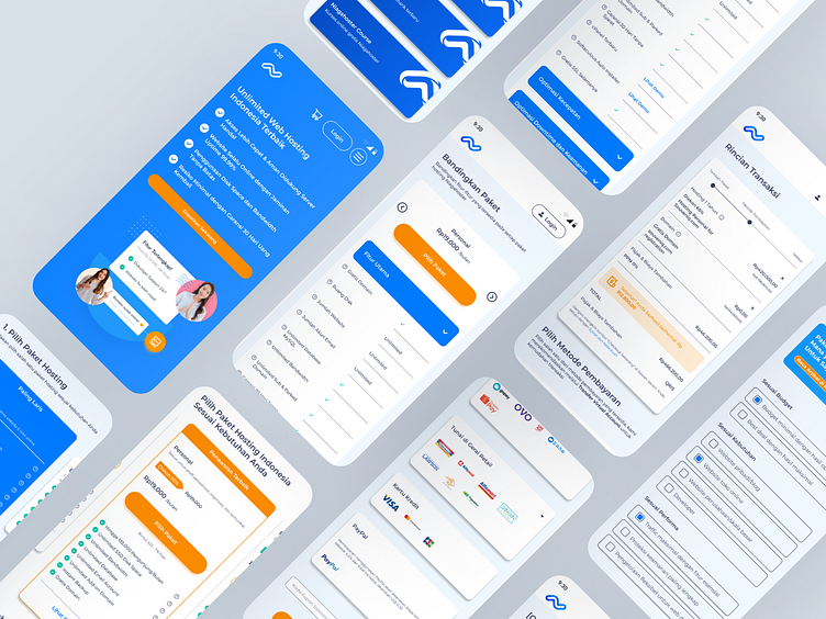
💻 Niagahoster Checkout Flow Redesign 💻
💻 Niagahoster Checkout Flow Redesign 💻
Proud to share my exploratory case study on redesigning the checkout flow for Niagahoster's mobile website. The goal was to streamline the process, improve usability, and reduce cart abandonment, leading to a smoother and more intuitive experience for users.
Want to dive deeper into the full case study? You can read it on Medium or visit my personal website for more insights!
More by Fajar Shiddiq View profile
Like
