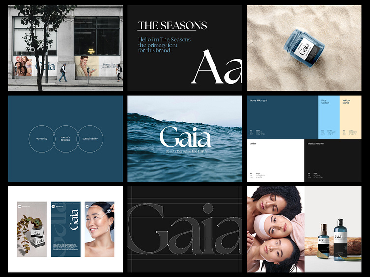
Gaia - Beauty Brand Guidelines
Project Overview
Logo exploration for Gaia, a brand deeply rooted in nature's essence. The elegant serif font exudes sophistication while maintaining an organic flow, symbolizing the balance between beauty and the Earth. The subtle transition of the word 'from' in the tagline creates a delicate contrast, emphasizing Gaia's origin and connection to natural elements. Set against a serene ocean backdrop, the logo draws inspiration from the vastness and tranquility of the sea, embodying the brand’s ethos—beauty born from the Earth. This exploration aims to strike a perfect balance between modern refinement and natural grace.
Brand Implementation
Let's collaborate with us
🛍️ Download our Premium UI Kit on
Follow our pages and join the journey
Instagram | LinkedIn | Behance
📨 inquiry@caraka.io | 🌐 caraka.io
More by Caraka View profile
Like


