Doctor Appointment Booking App Design
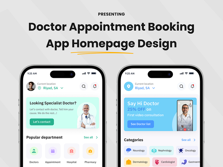
Hey Dribbblers! I’m excited to share two different home page designs for a doctor appointment booking app, each provides to different user needs. Let’s dive into their purpose, UI choices, and why I chose these styles:
Design Left: Fast and Direct Access (Mint-Green Theme)
🔹 Goal: Get users to contact doctors quickly with minimal steps. Perfect for those who need urgent care or quick booking.
🔹 Features:
✅ Quick access to specialist doctors with prominent “Contact” buttons.
✅ Department-based navigation for fast browsing.
✅ A soft, calming mint-green palette that creates trust and simplicity.
Design Right: Explore and Book (Blue Theme)
🔹 Goal: Encourage users to explore categories, compare doctors, and take advantage of promotions.
🔹 Features:
✅ Clean, professional blue theme for clarity and trust.
✅ Category browsing with color-coded specialties.
✅ Appointment scheduling and discounts for first-time consultations.
Both designs offer unique advantages—whether you want a quick booking experience or prefer to explore options with detailed info. Let me know which one you prefer! 💬👇
#AppDesign #UXUI #DoctorApp #HealthcareTech #AppointmentApp

