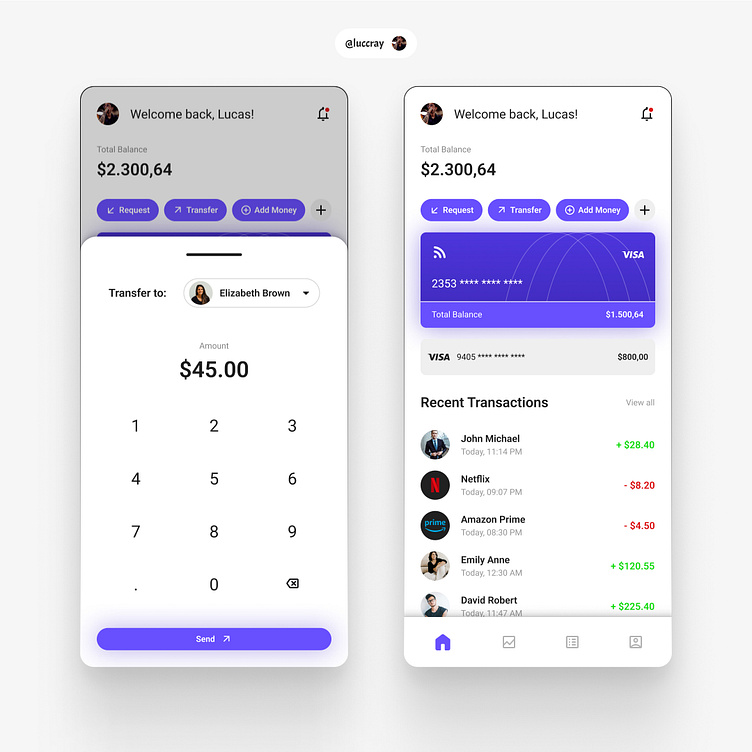
A Modern Take on Mobile Banking App Design
Hello!
This time, I'm sharing with you two more interfaces for a mobile banking app.
I’ve noticed that many banking apps neglect usability, overcrowding their screens with functionalities that could easily be placed in menus.
In these interfaces, I’ve prioritized the most commonly used functions, while following industry standards to ensure a quick learning curve.
The layout is modern and includes the most sought-after information when opening a banking app.
What do you think?
More by Lucas Cray View profile
Like

