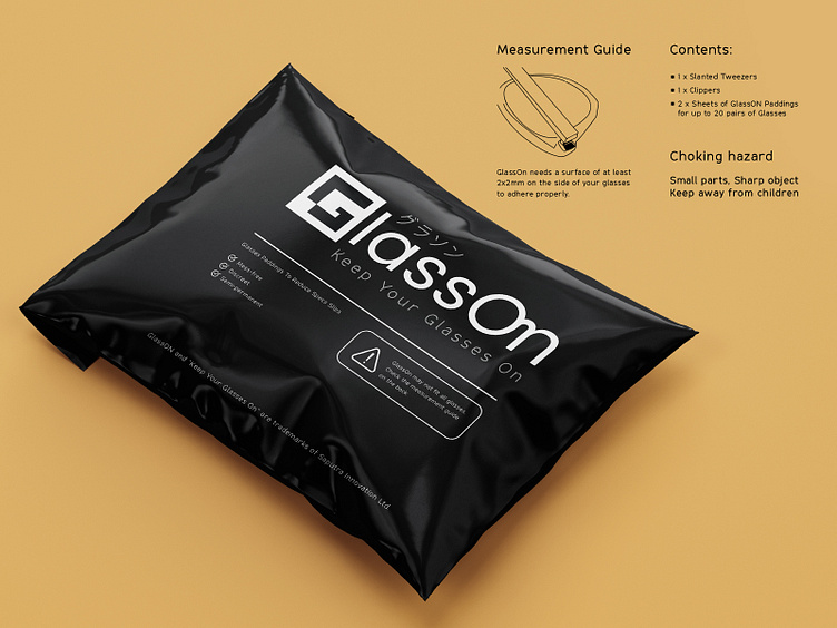
Mailer Design for GlassOn
The mailer design for GlassOn embraces a sleek, minimalist aesthetic in striking black and white, perfectly reflecting the brand's modern approach to eyewear care.
This elegant yet straightforward design captures attention and conveys the essence of simplicity and effectiveness that GlassOn stands for.
Contact us today for your distinctive and minimal package designs!
More by Temis View profile
Like
