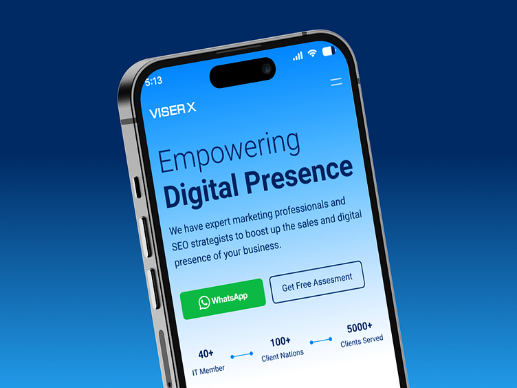
VISER X Wesbite Mobile View Design
Hello!
Here’s a sneak peek of the mobile-optimized hero section for VISER X’s website. This clean, minimal design captures the essence of VISER X's mission to "Empower Digital Presence." The bold typography ensures readability on smaller screens, while the CTA buttons, such as "Get Free Assessment" and the WhatsApp integration, offer quick, seamless interaction for users on the go. With a focus on delivering a smooth and responsive user experience, the design adapts flawlessly to various screen sizes, ensuring that visitors can connect with VISER X’s services anytime, anywhere.
See the full case study on Behance
Live site viserx.com
Looking to make your brand iconic?
"Want to know more? Say 'Hi' to my
📞What's App
Let's talk about your project..
✉️ mdmosaddak6@gmail.com
➡️ Review our complete design case studies on Behance.
Tap follow for a stream of aesthetic design inspiration.

