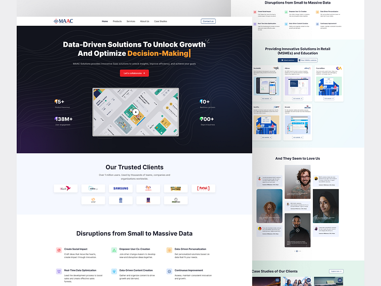
SAAS Website Redesign
Overview
Market Access Analytics and Consulting (MAAC), The company concentrates primarily on providing solutions to retail (mSMEs) and education fronts • Their business model is purely SAAS driven.
Current Website Analysis
Cluttered Layout: The original site had too much technical jargon and unnecessary details, making it hard for users to find essential information.
Complicated Navigation: Users struggled to navigate through confusing menus, with important solutions hidden or buried within the content.
Weak CTAs: Call-to-action buttons lacked visibility and clarity, causing users to miss key interactions that could lead to conversions.
Poor Typography: Inconsistent font choices and low contrast between text and background made readability a challenge.
Inconsistent Branding: The use of varying colors, fonts, and imagery diluted MAAC Solutions’ brand identity.
Technical Language: Content was packed with overly complex technical terms, making it less approachable for a broad audience.
Redesign Improvements
✅ Simplified Layout: Removing unnecessary jargon and prioritizing essential information has made the website more user-friendly and easier to navigate.
✅ Vibrant CTAs: Call-to-action buttons were given a boost with contrasting colors and clear language, making it easy for users to understand the next steps and take action.
✅ Improved Readability: I chose the "Inter" font for its legibility and modern look, paired with an appropriate font size to enhance user comfort. I also ensured strong contrast between text and background colors for better readability across devices.
✅ Consistent Branding: Used a unified color palette, consistent fonts, and cohesive imagery to create a strong, recognizable brand identity. This consistency builds trust and reinforces MAAC Solutions’ position as a leader in SaaS-driven innovations.
✅ Simplified, Accessible Content: Replaced technical terms with clear, user-friendly language that resonates with both the retail and education sectors. The content now speaks to decision-makers in a way they can easily understand.
What’s Next?
This redesign is just the beginning! The updated UI/UX ensures that fostering innovation is clear, making it easier for users to connect, grow, and succeed.
Check it out and let me know your thoughts!
🌟 #WebsiteRedesign #UIUX #ProductDesign #Redesign #Website #SAAS


