L4X Logo Design
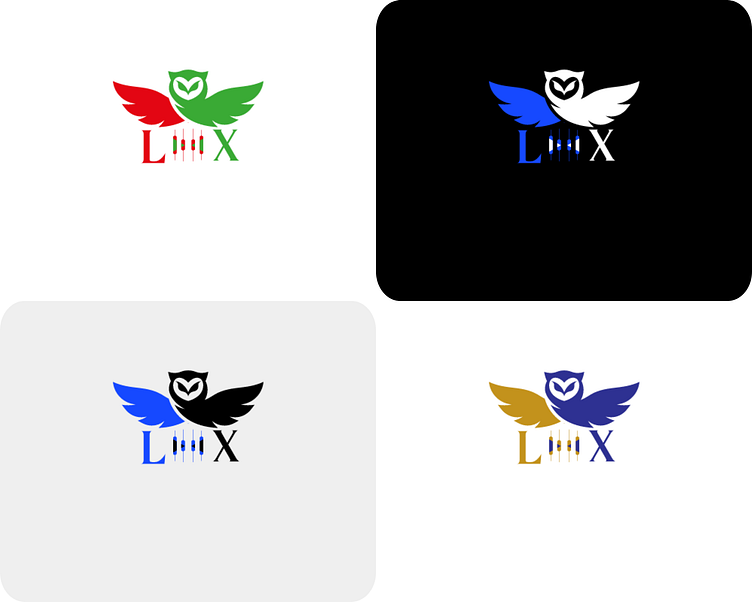
I created this logo for L4X, a brand that represents precision, strategy, and insightful decision-making. The design incorporates symbolic elements that reflect the core values of the brand, while the variations in color schemes offer flexibility for different applications.
Design Elements:
Symbolic Representation:
Owl and Wings: The central imagery features an owl with spread wings, symbolizing wisdom, vigilance, and agility—qualities that are essential for navigating complex situations. The owl is positioned above the brand name "L4X," indicating a focus on foresight and strategic thinking.
Candlestick Chart: Integrated within the "L4X" text, the candlestick chart emphasizes the brand's connection to data analysis, financial insight, and strategic decision-making.
Color Palette:
Red and Green: This color scheme represents growth and caution, perfect for financial or strategic contexts where precision is key.
Blue and White: A clean and professional combination, conveying trust, reliability, and a corporate feel.
Blue and Black: A modern and bold palette, emphasizing strength, confidence, and a forward-thinking approach.
Gold and Blue: A luxurious blend, adding a touch of prestige and sophistication to the brand's identity.
Typography:
L4X: Displayed in a bold, modern font, ensuring strong brand presence and easy recognition. The use of different colors within the text adds versatility and visual interest.
This logo is designed to be versatile and impactful across various mediums, from digital platforms to printed materials. The included 3D mockups help to visualize the logo's application in real-world settings.
