DAY 08 - 404 PAGE DESIGN | 100 DAYS UI CHALLENGE
Day 08: UI Challenge - 404 Error Page
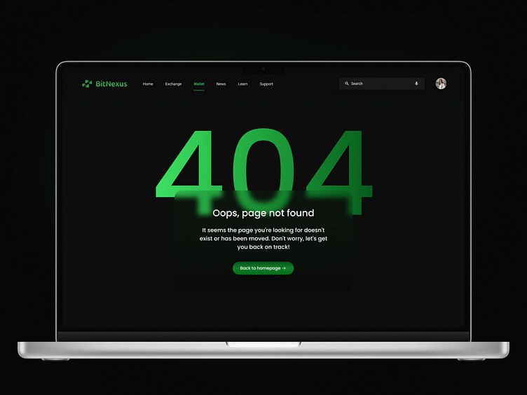
🔍 Challenge: For my Day 8 submission of the 100 Day UI Challenge, I designed a 404 error page with a clean, modern aesthetic for a cryptocurrency platform, BitNexus.
👁 Design Breakdown:
Hero Section: The massive green "404" text dominates the page, instantly informing users they've hit a dead end. Its neon glow effect is visually striking, adding a sense of urgency while maintaining the platform’s tech-forward look.
Oops Message: A friendly yet concise message, “Oops, page not found,” reassures users that they’re in the right place but might have taken a wrong turn. The smaller paragraph beneath gently encourages them to navigate back, keeping the tone helpful rather than frustrating.
Call to Action: The "Back to homepage" button in a rounded green design is bold and noticeable, ensuring users can easily find their way back. Its placement at the center maintains symmetry and functionality.
Navigation & Branding: The top navigation bar remains intact, allowing users to switch to other sections like Home, Exchange, Wallet, etc. This keeps the 404 page integrated within the broader website experience, and the BitNexus logo stands out in the top left to reinforce brand identity.
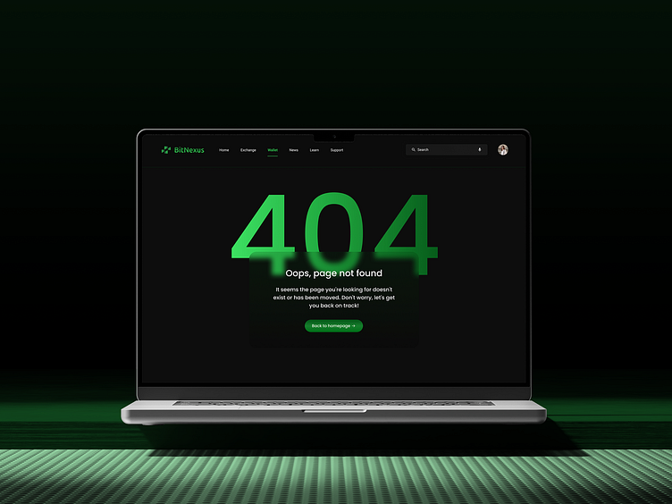
Visual Elements: The overall design is simple and sleek, with the dark background ensuring that the green elements pop. This clean look reflects the brand’s modern, tech-savvy image while maintaining a user-friendly interface.
This 404 page design focuses on clarity and ease of navigation while keeping the visual style consistent with the BitNexus platform. Let me know what you think, or if there are any suggestions! 😊
