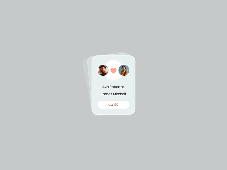
Ui Components - Matches card
Hello friends🙌🏻😍
Recently, I was busy designing a dating app. In this app, users had to register before going to a place and meeting their partner, making sure of the presence or absence of a partner for themselves at that location.
These three cards are designed for three different situations in terms of finding a partner for the participants.
The first card is for when no suitable match has been found for the user.
The second card is for when two users have matched, but they have not yet connected (they have not yet accepted each other).
The third card is for when two users have matched and have become each other's partner.
Thanks for watching!❤️
Your feedback and appreciation is always welcome 🥰
More by Kimghazl Design View profile
Like

