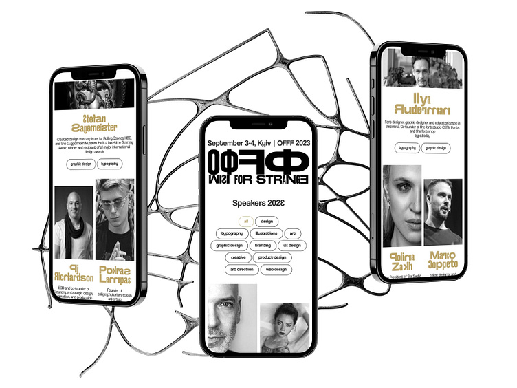
Wish for Strange | Mobile Version
In this shot I present the mobile version of the 'Wish for Strange' design conference website. The design adapts seamlessly to smaller screens while retaining its unique and bold aesthetic, with the black, white and matte gold accents fully intact.
The algorithmic grid used throughout the site ensures that content remains organized yet dynamic on mobile devices. This mobile layout balances style and functionality, providing an intuitive user experience without sacrificing creativity.
Learn more about the project and design process by viewing:
🖤 the full case study on Behance
✉️ Let's create something awesome together:
More by Mariia Vlodarchuk View profile
Like

