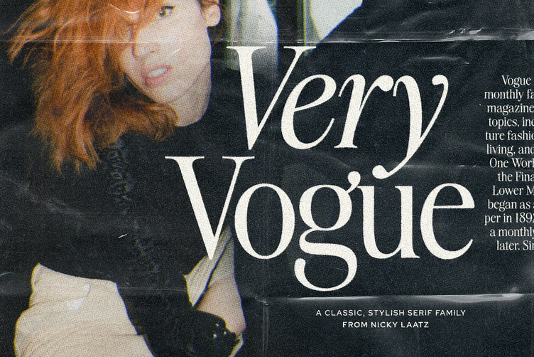
The Very Vogue Serif Family
Based on glamourous fashion magazines from the 80's and beyond and dripping with class and pizazz - say hello to The new 'Very Vogue' Serif family!
Classic and refined, and the epitome of style, Very Vogue Serif Family has soft curves and attention to detail make Very Vogue Display Serif a must for any projects requiring that upper level of class. Truly versatile - She also has a tomboy side - with her twin : The heavier subfamily :
Large and small optical sizes :
This Type family comes with two sub-families - 'Display' and 'Text'.
The Display sub-family is suited to larger type ( larger optical sizes and designs) - think headlines and large impactful letters on a page. It has a higher contrast and has naturally tighter letterspacing.
The 'Text' subfamily, with less contrast, a slightly heavier weight, and looser letterspacing, is better suited to large volumes of smaller type - like body copy - although don't be discouraged from using it at larger sizes - as if you are going for a bolder look - this is the one to use.
TIP : Don't forget to play with your letterspacing for even more stylish impact - for larger display type, tighten the letterspacing, and the opposite for smaller type.


