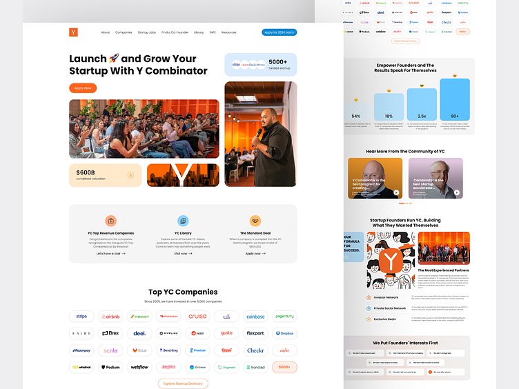
YCombinator Website Redesign
Hi creators and founders! I just completed a redesign of the YCombinator website, aimed at amplifying user experience and capturing the energy of startups around the world. Here’s how I made it happen:
Key Challenges:
Over-complicated site structure made exploration difficult 🔄
Outdated design elements not aligned with YC’s forward-thinking mission 📅
Lack of clear user paths, making engagement tricky ❗
Redesign Highlights:
✅ Simplified Navigation: Improved navigation, reduced cognitive load, and increased overall satisfaction.
✅ Vibrant Visuals: Modernized the overall look with sleek UI components, bold colors, and improved readability.
✅ Enhanced User Experience: Introduced new interactive elements to keep users engaged and interested.
✅ Clear Content Flow: Improved the user journey with smart hierarchy and clean design.
What’s Next?
This redesign is just the beginning! The updated UI/UX ensures that YC's message of fostering innovation is clear, making it easier for founders and innovators to connect, grow, and succeed.
Check it out and let me know your thoughts!
🌟 #YCombinatorRedesign #UIUX #ProductDesign #Redesign #Website #Startup


