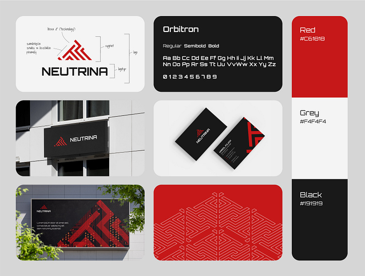
NEUTRINA | branding
The rebranding of Neutrina was one of the most satisfying ones I have ever created.
The client's guidelines clearly stated that the logo should contain both the shape of a pyramid and the letter "T".
Wanting to fulfill the client's will, but at the same time creating something that would not bring to mind a copy of Skynet, I focused on a strong, clear design that allows for containing information and graphics in the shape of a logo without covering the most important elements, as can be seen in the visualizations.
The idea of a new version of Neutrino was immediately approved by the client.
More by Magda Ryszewska View profile
Like
