Wedding Agency Website
💌 Have a website idea? Let's bring it to life together!
hello@ronasit.com | Telegram | WhatsApp | Website
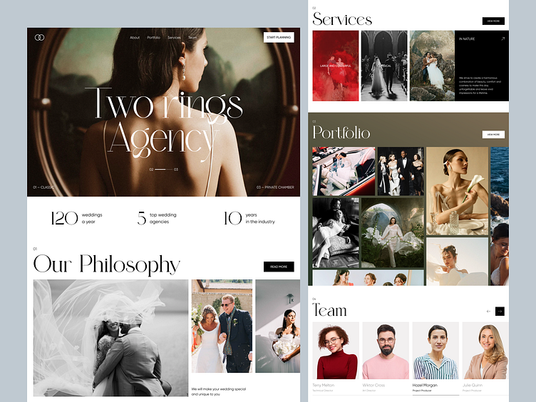
Hi all! Today we’d love to present you with the concept of a website for a wedding agency. Let’s take a closer look at its unusual UI and layout.
On the website, users can discover the agency’s achievements, and philosophy, scroll through the list of services and a portfolio, and find out about the team that would accompany their wedding.
It was decided to choose a neutral black-and-white color palette for the website so users wouldn’t get distracted while looking at bright wedding photos from the portfolio.
We designed the layout that fits as many vivid photos from the weddings as possible. That’s because these photos would most likely be the thing that persuades the potential customers to use the services of the agency.


