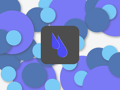
DailyUI / 005
Dark Sky is likely one of my all time favorite app. The problem I see with it, isn't the price point of the app (as it's well worth the price), but with the slightly intimidating graphics. Numerous friends and family members have avoided the app because of the ominous emotion the app carries with it.
What I've done here is give the user a hint of a more approachable Dark Sky app icon and UI elements (the bubbles) and softened up their brand color palette. The app on a whole would benefit from a more spunky, cartoonish feel.
(I'm a harsh critic and was moments from scrapping this entire project, but I've decided that doing so – in lieu of shipping something – isn't beneficial to my growth as a designer.
More by StillUpMySleeve View profile
Like

