CASHEWNUTS | PACKAGING DESIGN
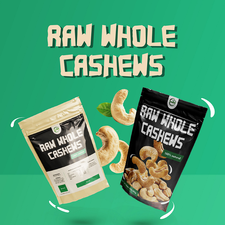
The Cashewnuts packaging was designed by Bee Art with a fresh, prominent image of cashews that clearly shows the brand's main business product. This not only increases the aesthetics of the packaging but also helps to strengthen the brand's product trust. In addition, the packaging is also designed with the product name "Raw Whole Cashews" using a bold, easy-to-read font, giving a strong and trustworthy feeling.
The packaging combines two main color tones, black and green, this combination helps to emphasize the natural origin and high quality of the product. At the same time, black also brings a sense of class and sophistication to the product. In addition, the packaging is also designed with clear, prominent product information along with the words "100% Natural", which helps the brand emphasize the purity of the product as well as provide complete and clear information about the ingredients in the product to customers.
-
Client Cashewnuts
Packaging Design Project. Packaging is designed for Cashewnuts.
Copyright© Bee Art. All Right Reserved
Contact us:
• Hotline/ Zalo: (+84) 77 34567 18
• Email: info@beeart.vn
• Website: www.beeart.vn
• Facebook: https://www.facebook.com/BeeArt.vn


