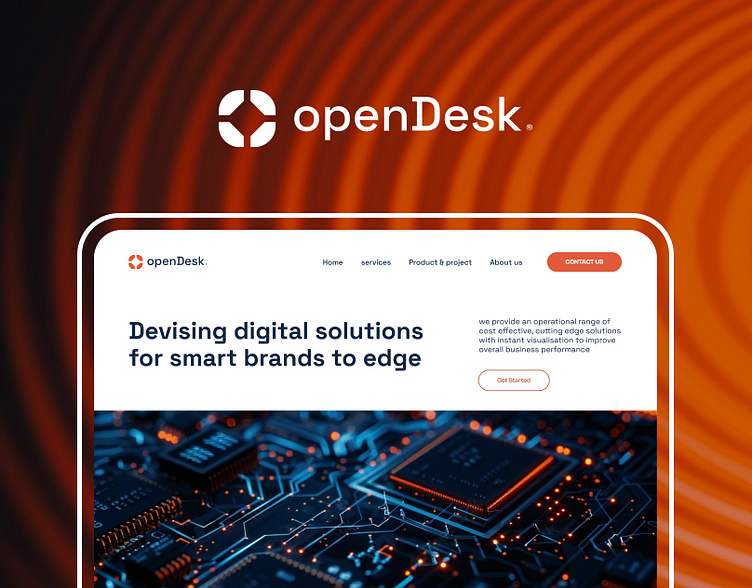
OpenDesk Website UI/UX
I redesigned openDesk website into a more modern, professional, and user-friendly platform with the improvement of visual hierarchy, readability, and content clarity with a cohesive layout, stronger typography, switch to industry-specific images and a vibrant color scheme made the brand appear more professional. Also, enhanced CTAs and better navigation significantly improved user engagement and overall usability.
More by Adkol Ibraheem View profile
Like


