Redesign_Medium_fake project
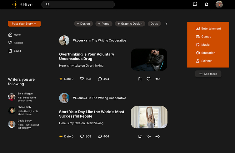
As a Medium user, I wanted to redesign their Feed Web page.
From where did I start
I started from their Feed page, I saw how the page looked cramped and wanted to make it look cleaner, minimalistic, and modern.
Removing the extra content on the right side and replacing it with an easier navigation sidebar, making the recommended content a choice for the user to explore the different topics he might be interested in.
Made it simpler to navigate through the web page by adding three main elements that are important to the user. To navigate back to the home page, to view their favorite stories, and to review their already saved stories on their list for quicker use.
Added the writers that the user follows to easily get to the profile of their Writer and read their content.
Made the category bar look simpler and easy to use, and gave it space between the content element and the category bar.
Changed the top navigation element by removing the call for action button and changed it from a small icon button to the call for action button to be more visible and understandable to the new users.
Added the notification element for messages from other writers.
The whole theme of the new website was to make it more modern, giving it personality with a touch of color, in this example, the use of orange. Keeping it intuitive, easy to use, and minimalistic as much as possible.

