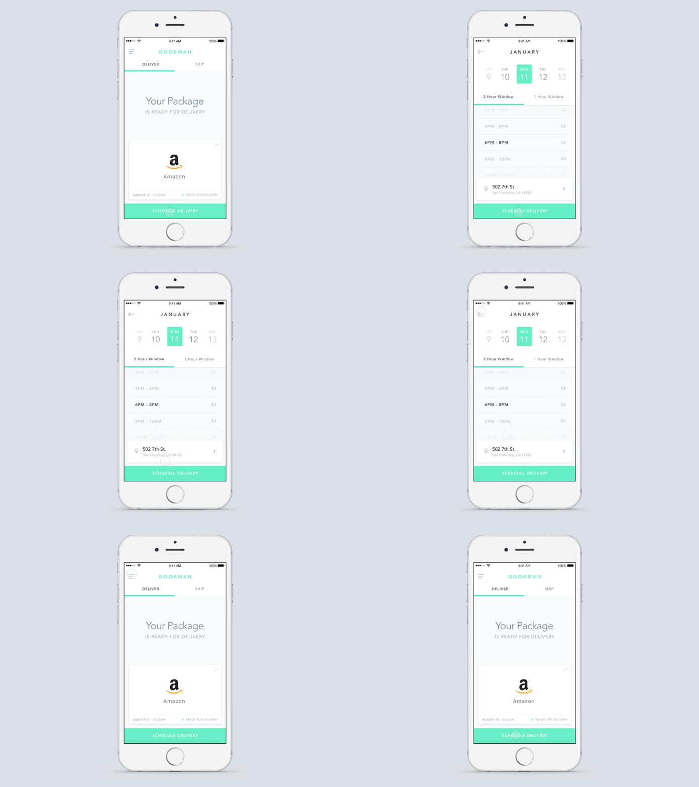
Schedule UI Transition
Doorman's been going through a lot of upgrades lately. But while last month's app visuals were definitely an improvement from the last version, users reported a "slow 'n heavy" feeling to the new app.
User feedback is extremely valuable in terms of customer satisfaction and prioritizing a never-ending list of engineering priorities. In this case, a combination of animations lasting just a third of second (.3s!) and multiple screen "switching" were contributing to this challenge.
Here's a preview of incorporating the feedback and insights to better use transitions for a clean, light, and fast user experience. As always, I welcome your feedback, too!
More by Zach Krasner View profile
Like
