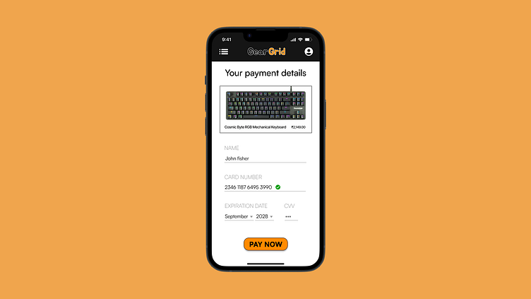
Daily UI #002 - credit card checkout page
For Day 2 of my 100 Days of UI Challenge, I have designed a clean and user-friendly credit card checkout page. This design focuses on a smooth and intuitive user experience, ensuring that the payment process is straightforward and efficient for users. I aimed to incorporate a minimalistic aesthetic with a well-organized layout, making it easy to enter credit card information and review the payment details.
Feedback and constructive criticism are welcome, as I'm always looking to improve and refine my designs. Thank you for taking the time to view my work!
More by Saksham View profile
Like
